Creating my portfolio website wasn’t just about putting my work online—it was about telling a story, showcasing my personality, and making sure every pixel had a purpose. In this article, I’d love to take you behind the scenes and share the steps (and little creative detours) that brought this site to life.
Setting the Vision
Before writing a single line of code or picking a template, I asked myself a few key questions:
- What do I want visitors to feel when they land on my site?
- How can I reflect both my creativity and my technical skills?
- What kind of projects and clients do I want to attract?
I decided on a clean, minimalist design that would put my work front and center. I wanted the experience to feel calm and confident, with a touch of personality—like a well-designed studio space where everything has its place.
Choosing the Right Tools
I’m a big believer in using the right tools for the job. For this site, I chose:
- WordPress as the core CMS for its flexibility and scalability.
- Elementor to speed up the design process with visual controls.
- Custom CSS & JavaScript for added polish and subtle interactions.
- Figma for early layout and UI design.
- Adobe Illustrator & Photoshop for visual elements and branding.
Combining no-code/low-code tools with some custom code gave me the best of both worlds: speed and control.
Designing the Look & Feel
UX First, Always
From the navigation to the contact form, everything on the site was designed with the user experience in mind. I wanted it to be intuitive for anyone browsing—whether they’re on desktop, tablet, or mobile.
Clear structure, concise text, fast load times—these were all priorities.
Building & Iterating
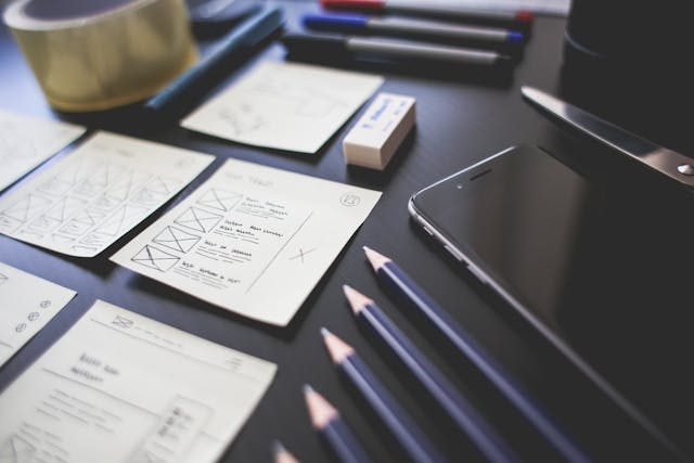
I didn’t build the site in one go. I sketched, tested, revised. I tweaked the layout after seeing how it felt on mobile. I rewrote my “About” section more times than I care to admit.
That’s part of the process—design is never really done, only evolving.
Final Thoughts
This website is more than a portfolio—it’s a reflection of how I think, create, and solve problems. It’s also a space that will grow with me as I explore new tools, techniques, and challenges.
If you’re a fellow creative, I hope this gave you a bit of inspiration. And if you’re here as a potential client or collaborator—welcome! I’d love to hear from you.
Thanks for reading,
